Classy Stuff

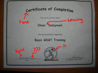
I got this certificate at work the other day. Normally I would feel pretty proud of getting such things, but after observing the certificate for two seconds, I was ashamed my name was on it.
As you can see the dominating font on this certificate is Comic Sans MS. Now let me take a wild guess, not an educated one, just a wild one, isn’t the font supposed to emulate a font used in comics?? Why the hell would you use it on a serious paper, like a certificate? The usage of this font especially ticks me off. For some reason people think it’s classy. I have seen it in PowerPoint presentations, e-mails, even in notes from professors. The font is good, only when used in the right context. I bet you anything it’s the HR lady’s favourite font, and she probably used it on her wedding invitations. Anyhow that’s the first thing I noticed.
Second was the date, which was typed in Times New Roman. I got nothing against that font, but my argument here is Be Consistent. It’s one of my pet peeves when I see any kind of document without consistency in form. Also notice the “4 hours” next to the date. Why? Is that important information? Does anyone care? I see no significance for the time my self, although you guys may.
Let’s now move on the extra space between my name and my last name. I know the intent here is to bring more attention to the name. But is that the best way to do it?
The man trying to roll the gear along is our logo. Poor guys I see him everyday, and the gear hasn’t moved in inch.
Oh yeah the wrinkles are compliment of me. This certificate sat in my car for a good week, before moving to my table next to my other papers.
Lessons learned:
Used the right font for the right occasion
Be Consistent
Don’t provide too much information
As a side note, the course was great and I learned a lot. It’s a subject that I will pursue in a the near future.


12 Comments:
At 8/06/2005 5:00 AM, M!R@CHK@ said…
Hahahaha i cant but agree with you on the design of the certificate that if you can call it design :P
At 8/06/2005 10:11 AM, Phantom of the Blog said…
it is the thought that counts
At 8/06/2005 10:57 AM, Sara said…
This reminds me of when was kindergarden. My certificate looked smilar. Hahahaha... I think they should've tried a little harder. Hahaha... It's funny.
Good thing you enjoyed the course though...
At 8/06/2005 11:13 AM, Hovic Atokian said…
The design tells as if one has completed comic theatre's works!!!
At 8/07/2005 12:02 AM, x said…
Thanks Mira, it's nice to know a designer agrees with me.
Nurhan, that's true, in this case though, I'm afraid there was no thought!
Sara, your comments always crack me up. I guess at least it looks like A certificate.. wait I think it's still crap.
haha Aleppian, I think a comic theatre course would be much more useful
At 8/07/2005 3:12 PM, Roba said…
hahahaha thats hilarious! welcome to the world of the aesthetically unsatisfied.
At 8/07/2005 3:44 PM, x said…
Now I know how it feels Roba
At 8/11/2005 3:44 AM, Ihsan said…
Hehe, still, congrats for the certificate!
At 11/06/2015 10:05 PM, oakleyses said…
tory burch outlet, ray ban sunglasses, michael kors outlet, kate spade outlet, burberry outlet online, michael kors outlet, oakley sunglasses, prada outlet, jordan shoes, chanel handbags, louis vuitton, louis vuitton, louboutin, replica watches, ugg boots, tiffany and co, michael kors outlet, nike free, michael kors, christian louboutin outlet, louis vuitton outlet, ray ban sunglasses, louboutin outlet, ugg boots, louis vuitton, michael kors outlet, uggs on sale, burberry, nike air max, louboutin shoes, tiffany jewelry, longchamp, longchamp outlet, polo ralph lauren outlet, ray ban sunglasses, nike outlet, replica watches, oakley sunglasses, cheap oakley sunglasses, prada handbags, longchamp outlet
At 11/06/2015 10:14 PM, oakleyses said…
nike air max, hermes, north face, michael kors, nike free, ralph lauren uk, burberry, true religion jeans, mulberry, sac guess, hollister pas cher, ray ban uk, nike air max, new balance pas cher, michael kors, coach outlet, lululemon, michael kors, vanessa bruno, abercrombie and fitch, louboutin pas cher, true religion outlet, hogan, true religion jeans, hollister, ray ban pas cher, air max, lacoste pas cher, coach purses, sac longchamp, air jordan pas cher, nike roshe, longchamp pas cher, timberland, coach factory outlet, nike blazer, kate spade handbags, nike free run uk, coach outlet, nike air max, vans pas cher, air force, true religion jeans, north face, oakley pas cher, nike roshe run, michael kors
At 11/06/2015 10:23 PM, oakleyses said…
hollister, iphone 5s cases, nike huarache, herve leger, longchamp, ghd, oakley, lululemon, p90x workout, wedding dresses, new balance, soccer jerseys, mont blanc, iphone 6 plus cases, ferragamo shoes, iphone 6s plus cases, nike roshe, jimmy choo shoes, giuseppe zanotti, nfl jerseys, reebok shoes, s5 cases, hollister, north face outlet, celine handbags, north face outlet, iphone 6s cases, iphone 6 cases, timberland boots, beats by dre, valentino shoes, insanity workout, babyliss, nike air max, mac cosmetics, mcm handbags, nike trainers, soccer shoes, chi flat iron, bottega veneta, birkin bag, baseball bats, ralph lauren, iphone cases, vans shoes, louboutin, abercrombie and fitch, asics running shoes, ipad cases, instyler
At 11/06/2015 10:34 PM, oakleyses said…
canada goose outlet, juicy couture outlet, nike air max, pandora charms, ugg,ugg australia,ugg italia, hollister, ugg,uggs,uggs canada, canada goose uk, louis vuitton, thomas sabo, wedding dresses, juicy couture outlet, louis vuitton, supra shoes, links of london, moncler, moncler, converse, moncler, ugg boots uk, vans, canada goose, ray ban, louis vuitton, louis vuitton, converse outlet, karen millen, canada goose, doudoune canada goose, ugg pas cher, replica watches, sac louis vuitton pas cher, michael kors outlet, marc jacobs, moncler outlet, michael kors outlet online, moncler, montre pas cher, pandora jewelry, bottes ugg, moncler, moncler, gucci, pandora charms, swarovski, hollister, michael kors handbags, doke gabbana outlet, pandora jewelry, barbour
Post a Comment
<< Home